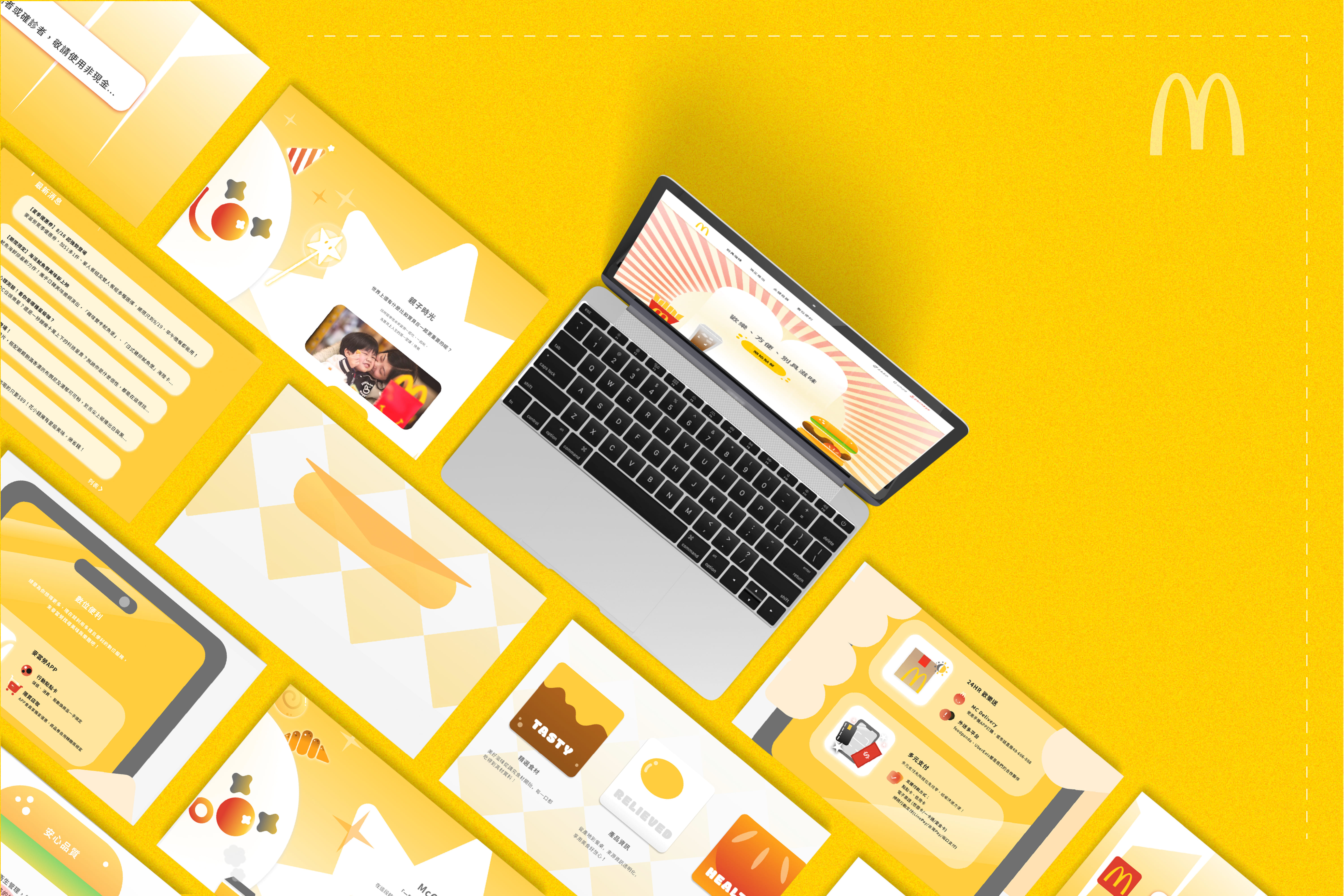
After analyzing McDonald's websites in Taiwan, Japan, South Korea, and neighboring countries, I found a common trend of utilizing minimalist interface design to highlight key information and guide users through clear navigation.
�This design approach enhances user experience, enabling visitors to locate desired information quickly and effortlessly. This project applies these insights to the redesign of McDonald's website, aiming to improve user navigation and overall satisfaction.
- ADVANTAGES
Comfortable Reading Experience
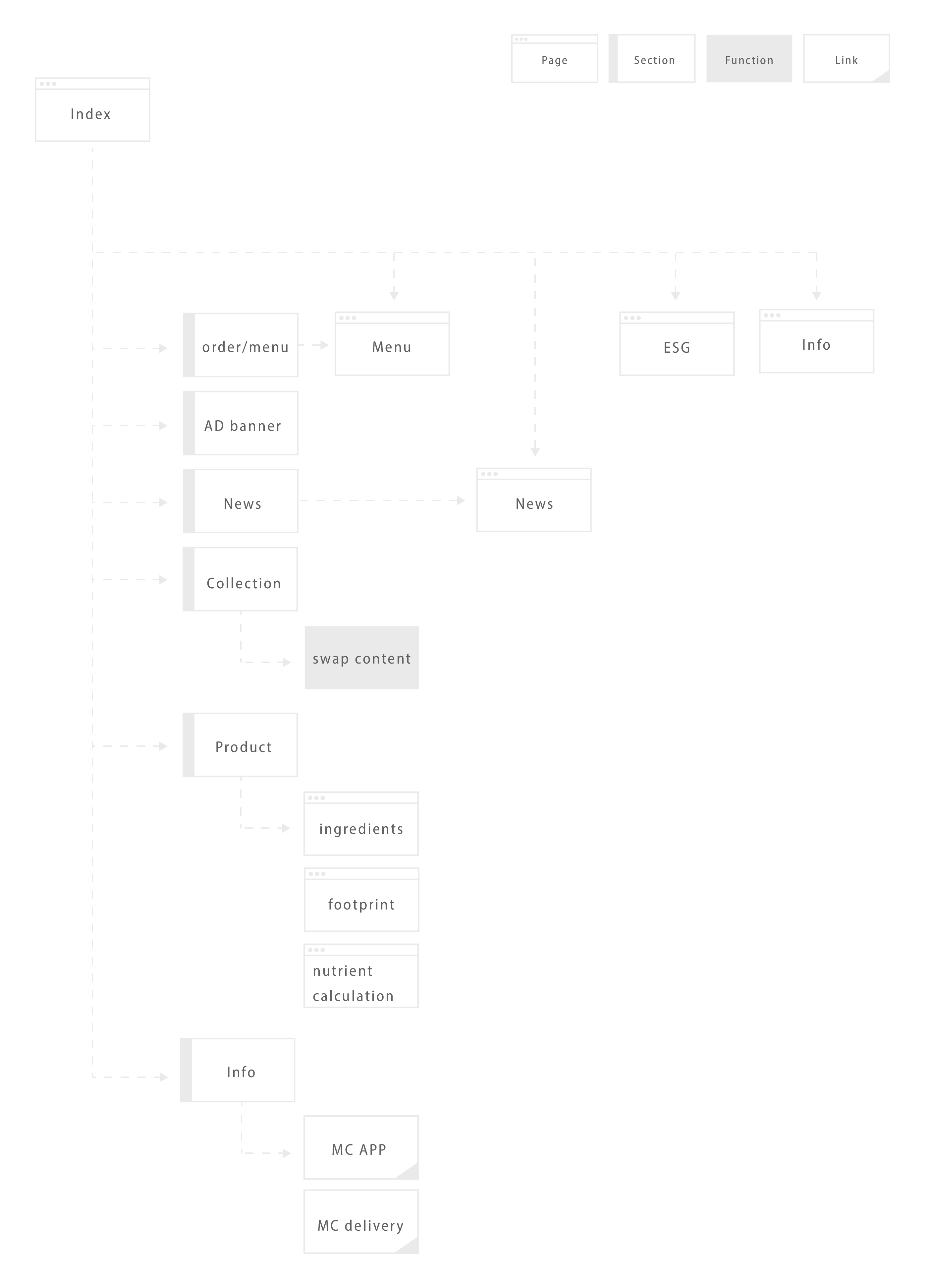
Clear Navigation
Highlighting Crucial Information - DRAWBACKS
Information Scarcity
Lack of Personalization
Excessive Advertisements Impact Experience